Do you often face similar situation, when both options are tempting, but you only can choose one of them?
Browser market has lots of options really. Konqueror, Rekonk, eLinks, Midori, Safari, Opera.
They have their own market share, but they are not leaders. Who are?
- Microsoft Internet Explorer
- Firefox
- Chrome / Chromium
Even though Microsoft Internet Explorer is still used by visitors, it does not belong to the category of free open source software. Purists can object that Chrome is also not FOSS. But Chromium is, and everything what works in Chromium also works in Chrome (but not vice versa).
So, we left with Firefox and Chrome(-ium) options. They are 2 different browsers, based on 2 different rendering engines, developed by different teams. But what to they have in common? They are both created for Internet browsing. Can we make them look similar? Yes, we can.
Let's chromisize Firefox and make it Chromofox!
I made my experiments with Firefox 5 in Mageia 1.0 and Aurora 7 in MS Windows XP.
All of the steps below are valid in both browsers, except for one which I will note separately.
Step 1
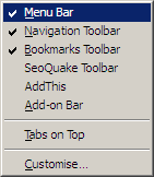
First of all, let's hide menu bar.
To do so, right click on the menu bar at any place and unselect checkbox "Menu bar"
As a result your menu bar got rolled into one button at the top-left corner: Firefox or Aurora. That is similar to wrench menu access in Chrome(-ium), although you can't move this button to the right corner where wrench menu is in Chrome.
As a side-effect for this, Aurora also hides window title, bringing window look quite Chrome'ish.
Using same method you can hide bookmarks bar, which is optional - you can still keep it in Firefox or Chrome.
Step 2
Next step is placing tabs on top of address bar. Chrome has this option by default. But your Firefox can have address bar above the tabs. "Tabs on Top" item in same menu as above is responsible for switch we're interested in.Step 3
Another feature which is not customizable in Chrome(-ium) is placement of navigation tools and extension buttons. They are on the left and on the right from address bar correspondingly. Of course, somebody can argue that option to move these items across the screen is useful. But in my opinion, this placement is the most logical among all browsers I've seen. Opposite to Chrome, Firefox allows you to move buttons around the screen. In order to move items, select "Customize" option from same menu pictured above. Let's use this feature and place items exactly same way as they are in Chrome. The only exception here is Stop/Refresh button - it is single button in Chrome, but two separate buttons in Firefox. Let's place them next to each other. |
| Moving buttons around |
Unfortunately, not all the items can be moved. Some Firefox Add-ons place their icons onto special bar - they can't be moved from there. Instead, you can convert your Add-on bar into set of icons with this Add-on.
Little hint here: even though it is not explicitly stated, Firefox's address bar in many cases works similar to Omnibox in Chrome. If you type your search query instead of address bar, you'll automatically get to search engine results page. It means you can also remove search box from menu if you wish. At the same time I'd like to warn you why you could wish to keep it. Chrome allows you to use search functions of different sites when you start typing address and then press Tab button (love this feature!!!). This does not work in Firefox. If you want to use different search providers, you still need the search box.
Step 4
Chrome(-ium) has feature to automatically place most used sites on the start page or show their previews when you open new tab. I love this feature!Unfortunately, there is no standard way to make something similar in Firefox (or I have not found it). Let's use Firefox's powerful tool of Add-ons to get what we want. The Add-on we will use is called New Tab King. By default it does not give you exactly the same view as Chrome New Tab window, but you can customize to make it similar.
Same New Tab King replaces two buttons (refresh and stop) with single combo-button. It brings our Firefox look one step closer to Chrome(-ium). That's what I got for my experiment:
 |
| New Tab King in Firefox 5.0 in Mageia 1.0 |
Unfortunately, at the time of publishing New Tab King Add-on was not available for Aurora 7.
Step 5
And finally, let's make our Firefox theme to be similar to Chrome with its rounded tabs. To do so, you again need to install Add-on, this time it is FXChrome. After installation, don't forget to enable it and restart Firefox. This Add-on hides Firefox button in the left-top corner of your window in version 5.0. You can still have menu by clicking on empty space, but I prefer to click on an icon. You can enable icon from this page by selecting the one you like and then installing Stylish extension.You don't need this Stylish installation in Aurora 7 though - icon exists in the left-top corner straight away here.
Et voila!
 |
| Chromofox (Firefox 5.0) in Mageia 1.0 |
 |
| Chromofox (Aurora 7) in Windows XP |
This is Firefox! But how many differences will you find from Chrome?
If you need more inspiration, look into a computer science major. There are some great resources at Guide to Online Schools.
This post was prepared while Firefox 5.0 was the latest version, and I only got news about Firefox 6.0 release when post was ready to be published. My dear readers, did you find same rules applicable in Firefox 6.0 as I have shown here in 5.0?

0 comments:
Post a Comment